
I find myself agreeing with Andy Rooney with alarming frequency.
I don’t believe he’s done a 60 Minutes commentary on the nuisance of automotive touch screens, but if he had one in his daily driver, which I assume is a 1930 Hudson/Essex he bought brand new when he was 50 years old, he would likely share my frustrations.

There’s nothing wrong with buttons. You push them (or in a car, you feel around for them) and an action occurs. Just fifteen years ago it was a big deal when standard cars adopted electronic pushbuttons in place of sliding climate control levers.
Now, touch screens are the trendy new thing in interior design, promising to provide one clean, central location to control everything. The problem is, like your computer at home, “everything” is buried in a mess on your hard drive, under several layers of menus and folders.
While I wouldn’t call myself luddite, I despise purposeless gimmicks intended to make drivers feel like they’re in something “advanced” without actually advancing or improving anything.
And I could wax nostalgic about the “good old days” when cars were more dependable because they were simpler, or safer because they were larger, but I’d probably be wrong. Modern engineering, computerization, and more advanced materials allow vehicles to enjoy a longer lifespan with less required maintenance, all while consuming fewer resources and producing less pollution.
I’m okay with technology, but it has to make life better, not worse.
Take for example Ford and GM’s capacitive-touch controls.
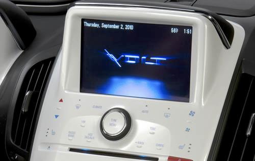
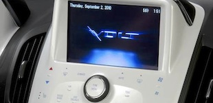
Instead of buttons, the Lincoln MKX and Chevy Volt have little bumps on flat plastic surfaces that feel like braille. When you touch the bumps, the charged surface senses your finger and activates whatever programming is necessary to perform the requested task, just like the display on an iPhone.
Unlike an old-fashioned resistive touch screen (which the Volt and MKX also have), there is no contact layer sandwiched between thin plastic sheets. With capacitive touch, your finger physically makes an electrical connection.
On paper, it sounds clever. Buttonless surfaces are nicer to look at and arguably last longer. If you’ve ever been in a GM product from the 2000s, you’ve probably noticed the poorly applied paint that slowly rubs off the buttons, leaving them white and blank like little Chiclets.
Unfortunately, in practice, because capacitive buttons rely on your finger to make direct contact with the surface, wearing gloves or having moist fingers (rain/snow) interferes with their operation, causing touch commands to frustratingly do nothing in response.
Most importantly, you lose the satisfying push of a real moving button, that little bit of physical interaction that connects you as a human being to your automobile. The end result is an input method that feels numb and offers no improvement in control.
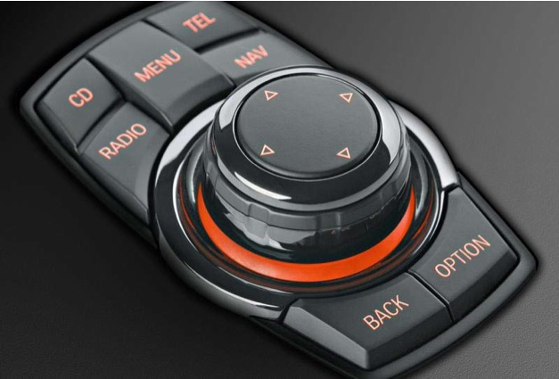
Mercedes, Audi, and BMW go a step further, replacing push-button functionality and standard touch screens with joystick-operated displays that control navigation, audio, climate systems, telephony, and in some cases performance and traction settings. Although it does a fine job of removing clutter from the dashboard, it has the unfortunate consequence of turning the driver’s seat into a desk chair. [Imagine using your laptop while driving.]
I will concede on one point — complex functions like navigation require more advanced input methods for zooming, panning, and destination entry. But having to go through layers of menus to enable seat heat (with MyFordTouch, for example) is obnoxiously counter-intuitive.
It may work on the Enterprise where Captain Picard can order Wesley Crusher to handle the controls for him, but its a danger and a hassle for the average American driver who has to be the captain of his own ship while managing its subsystems by himself.
This isn’t just an automotive problem. It’s a disease infecting every facet of modern living. My mom’s induction cooktop is a General Electric Profile series, fairly high-end stuff for a home cook. It even has a motorized vent that rises up from the counter. It’s black, sleek, and looks nothing like gigantic stove in Alex P. Keaton’s kitchen on “Family Ties.”

(Michael J. Fox, “Family Ties,” NBC)
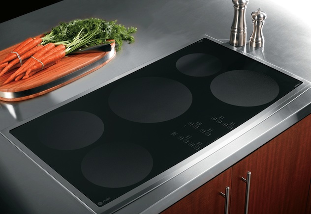
This wretched heap of modern insanity uses capacitive touch buttons (like those in the Chevy Volt) on a surface where water, heat, and moisture are always present. Once the buttons are covered in a couple drops of water you have to grab a rag to wipe them clean before you can use them, and even after wiping them clean they need a second or two to dry. Meanwhile, your pasta is boiling over, turning your Top Chef moment into one of Gordon Ramsey’s Kitchen Nightmares.
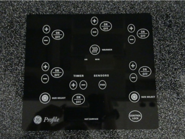
Perhaps, in GE’s carefully controlled development labs, there are no such things as spills or accidents, but in households where amateurs do the cooking, water will boil over, oil will splatter, and sauce will drip.
Like a high-end European luxury car, this expensive and over engineered appliance has been a source of ongoing misery, repaired several times and finally replaced with another at a cost of nearly two grand. Meanwhile, the low-end Hotpoint in my apartment has never failed, and my made-from-nearly-scratch marinara sauce turns out beautifully every time.
But I digress…
What one simple button (or knob, or switch, or lever) can achieve should not be replaced by cryptic menu-driven nonsense as it detracts from the focus and joy of driving.
Yes, joy! In the pursuit of technological nirvana, some have neglected the importance of motoring pleasure as we’ve turned our cars, at one time our gateways to limitless freedom, into rolling iPods and Androids stuffed with god-awful Rihanna ringtones.
Motoring (at least, for the types of folks who read this blog) is supposed to be about the senses — detecting the road surface through the steering wheel, listening to the tires, experiencing the pull of centrifugal force, feeling the hum and vibration of the motor, being reasonably comfortable, and hearing the tone of the exhaust.
The more feedback you receive, the more natural the machine feels, the more control you have over your vehicle, the more enjoyment you get out of driving. Simple.
Mazda calls it “horse and rider.”
Fast Tube by Casper
Together, these physical qualities create an emotional connection to machines that would otherwise be no more engaging than hair dryers. Emotions are what the unwashed masses, puttering around in sanitized boxes, have abandoned in favor of touch screens, driver nannies, and bluetooth bullshit.
The Lund family would probably disagree with me; I imagine most American drivers would.
Fast Tube by Casper
I don’t care about it being a “disease” affecting other areas – but I just saw a commercial for a buttonless car today and I was fearful of the safety aspect.
When I’m driving and I want to turn on the AC, I reach to my right. I figure out by shape what button my hand has landed on and move my hand up, further right, or wherever until I’m on the AC button. I do not have to move my eyes from the road if I don’t want to.
My ipod, however, continually requires me to move my eyes from the road. When I reach down blindly to skip a song and it doesn’t work (which happens about a third of the time) I then have to look down to see what’s happened. Did I miss the skip button and have simply paused it? Or did it not respond to my touch (which it won’t if my hands are too cold or too dry). This did not happen with my second gen ipod, with distinct buttons.
I also admit I text while driving….but I have to take my eyes off the road much, much more with a touchscreen phone than with a physical one.
Now yeah, this is stupid behavior, and I don’t make these into habits, but what I’m saying is that touchscreens require you to move your eyes from the road more than physical buttons, no matter the device. Replacing the actual car controls with touchscreen is a recipe for disaster, unless it’s like one of those google cars that can drive itself.