Part 1: 2011 Subaru Legacy 2.5, Deep Dish Pizza
Part 2: Cadillac
Part 3: Mercedes-Benz
Part 4: Chevrolet, GMC, Buick
Part 5: Volvo, Lincoln, Audi, The Green Man!
Part 6: Acura, Lexus, Land Rover
Part 7: Jaguar, Hyundai, Maserati, Aston-Martin, McLaren
Part 8: Ford, Honda, Chrysler, Jeep, Dodge
Part 9: Nissan, Mazda, Subaru, Suzuki, Kia
Part 10: Lamborghini, Classics, Retail Booths, Army, Scion, Volkswagen
Part 11: Greek Dinner, Portillo’s, Ikea, Conclusion
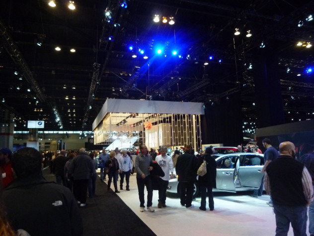
Lincoln’s display grabbed the most attention. The caged area looked like the inside of a government building from the 1960s.
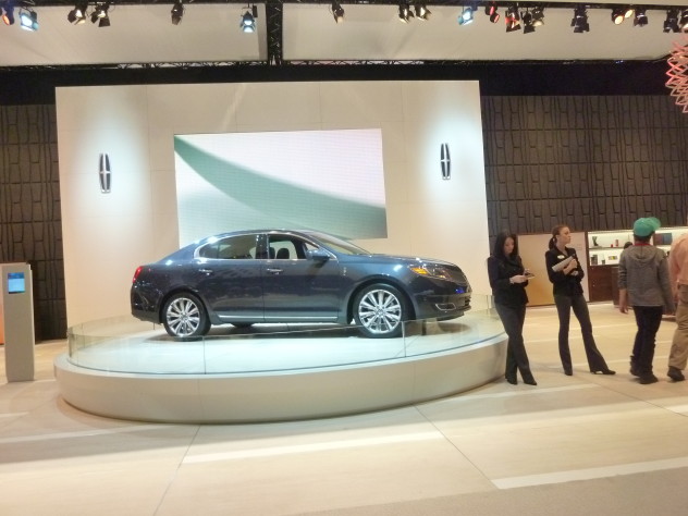
Unfortunately, no one cared about the newly refreshed Lincoln MKS. Even the models looked bored.
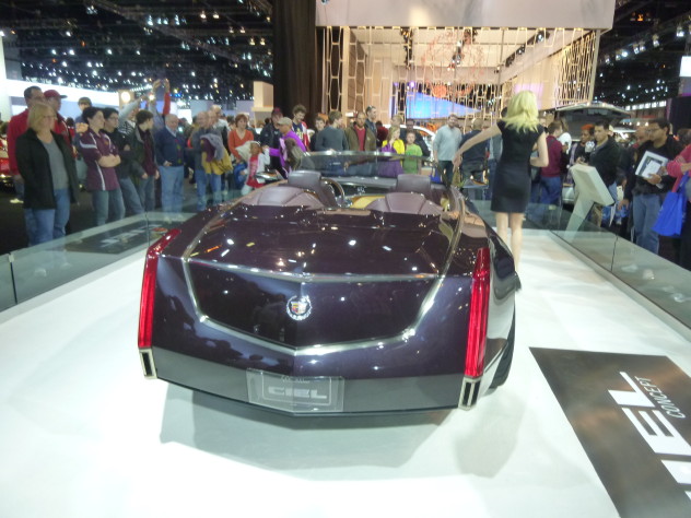
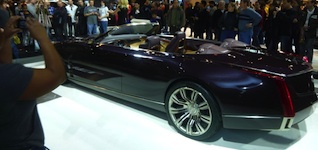
We wandered over to Cadillac. The Ciel concept was present and absolutely stole the show.
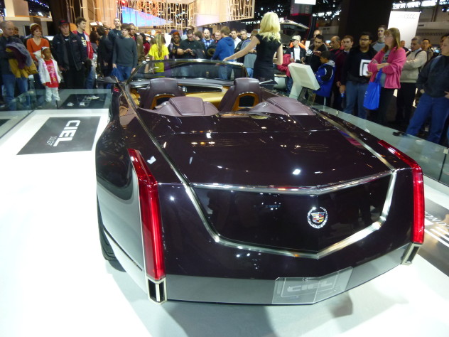
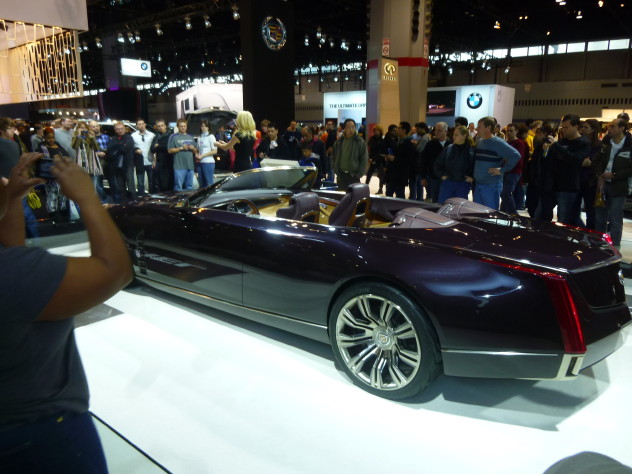
WOW
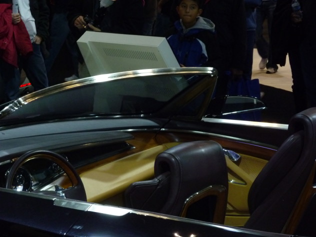
Wood procured from a 300 year-old tree that had fallen in Pennsylvania.
“Christine located what seemed like a prime candidate—a very rare, 300-year-old olive tree that had fallen in a storm in its native Naples, Italy—at Hearne Hardwoods in Oxford, PA, a wood yard outside of Philadelphia. Rick Hearne worked with Christine to find the perfect tree, and fortunately this one had already been dried in a kiln and been sequenced. Fortunately, the designers loved the Italian olive wood’s rich grain and markings, and the team set to work.”
More details on the Ciel’s wood trim: http://www.coolhunting.com/design/cadillac-ciel-o.php
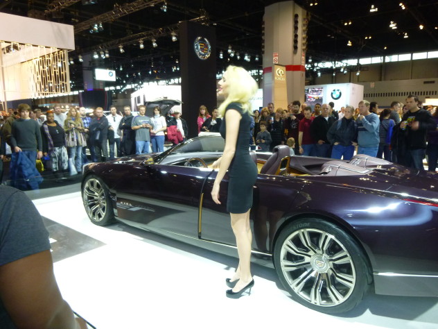
Our model and presenter, an acquaintance of Marvin’s, was knowledgeable and eloquent. Nice heels too.
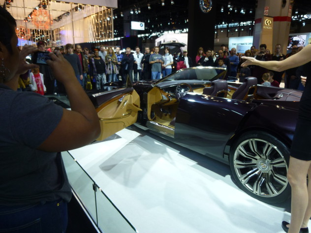
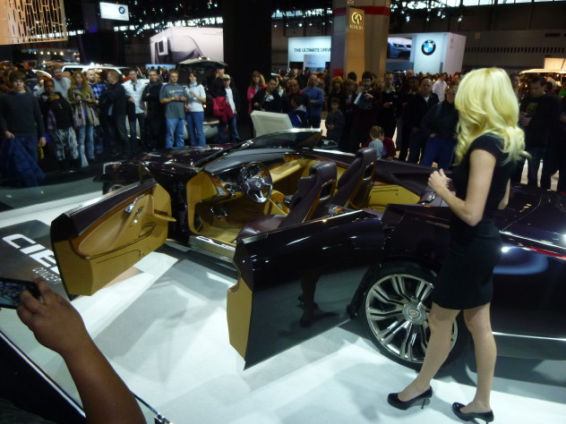
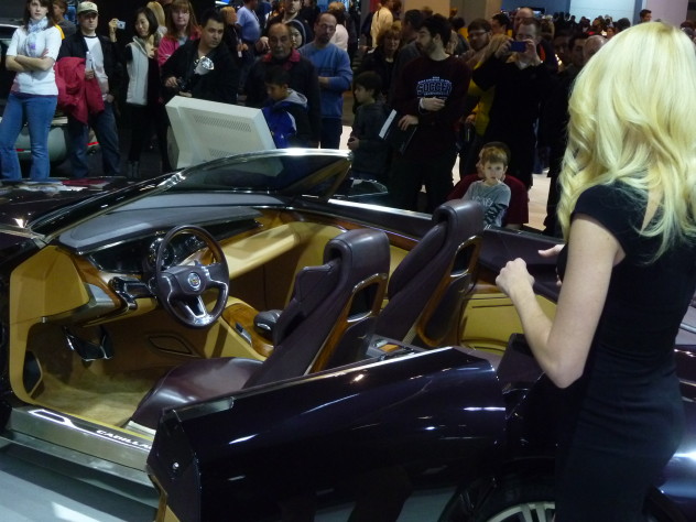
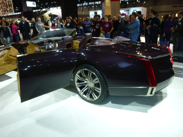
The shape of the tail lights recalls past designs by GM legend Bill Mitchell.
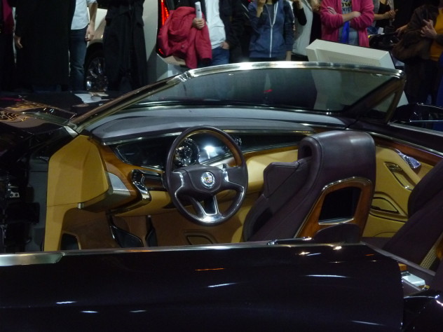
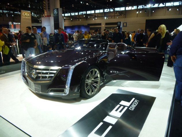
Honestly, I could have gone home after seeing the Cadillac Ciel and been completely satisfied with the show. Hopefully these design elements find their way into the Omega-based flagship sedan coming to Cadillac.
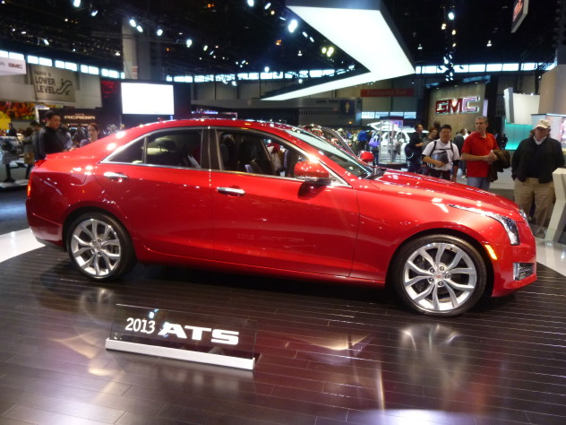
The ATS, which has a tendency to look a bit tall and plain in photos, is beautiful and well-proportioned in person.
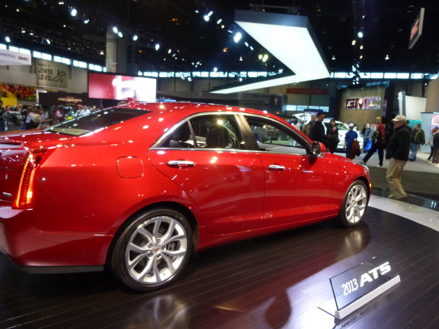
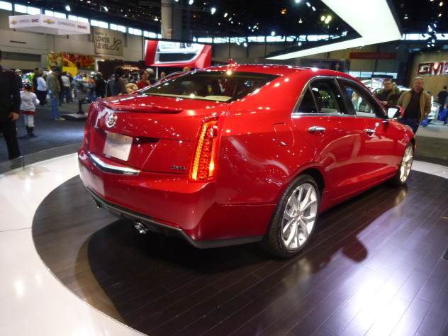
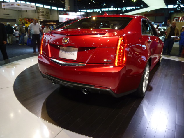
The rear end looks lower and leaner thanks to multi-tiered horizontal sculpting. The CHMSL/third brake light sits on a separate shelf, forming an LED spoiler. The license plate surrounded is accented by a tasteful piece of chrome that includes the classic Cadillac script. The exhaust outlets are a nice touch as well, with a honeycomb pattern on each side that emulates Italian exotics.
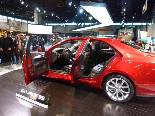
The back seat is small, likely on par with the BMW 3-series. Cadillac said its benchmark for performance and design was the E46 3-series, BMW’s sporty entry-level car produced from late 1998 to 2006.
The rear doors are enormous compared to the size of the back seat opening. The rear seatbacks are placed far backward to maximize legroom, creating a cocoon-like effect. I suspect ingress and egress may be a problem (or maybe not depending on step-in height). The back seats of entry-level sport sedans are rarely used anyway.
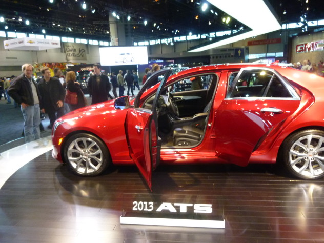
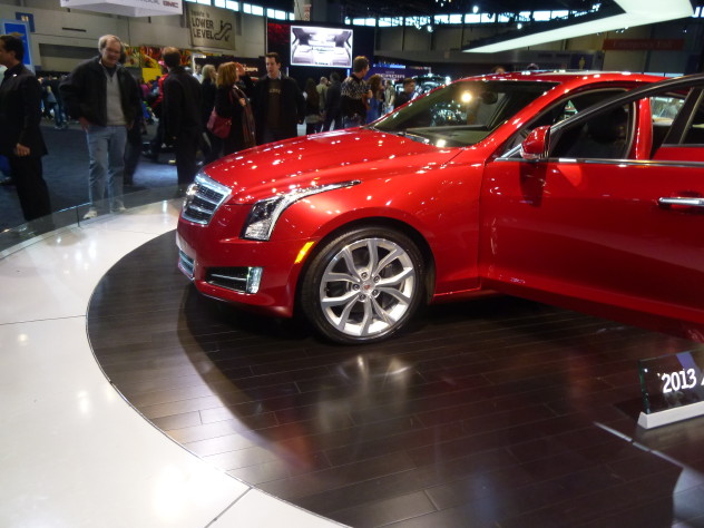
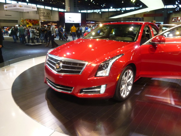
In GM’s initial photos, the nose of the ATS looked bland and characterless, like Art and Science had given way to Derivation and Political Correctness. Fortunately, in the flesh, the ATS’s V-pointed nose, swept back headlights, and horizontal chrome grille give an impression of power and prestige. It’s Art and Science with less vulgarity.
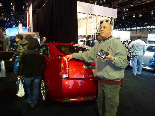
Gary is dead set on buying a CTS for his next car. The problem is, his pristine 2001 Seville might last forever.
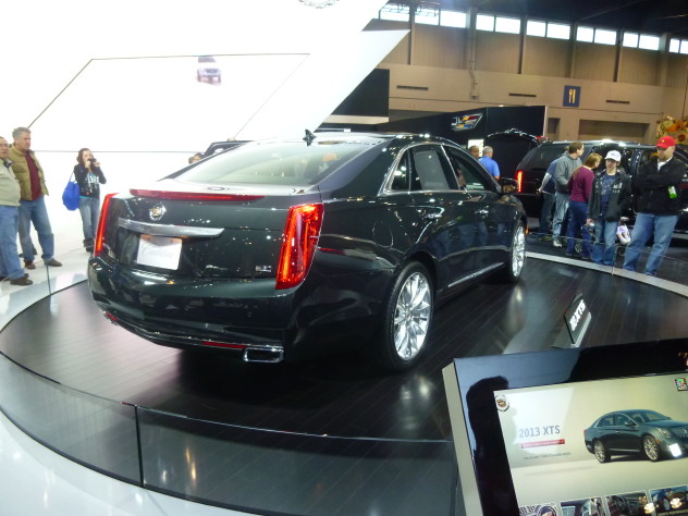
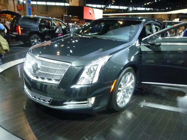
Contrasting with the stunning Ciel and impressive ATS was this miserable looking turd, the Cadillac XTS.
This V6-powered car isn’t meant to be Cadillac’s flagship, but it could be a modest competitor to the Lexus ES and Acura TL and RL. Unfortunately, this long sedan rides on the Buick Lacrosse’s much shorter wheelbase resulting in awkward proportions that make the XTS look tall, narrow, and confused about its identity.
There is no V-series XTS planned, but a turbocharged 3.6L version may arrive in late 2014.
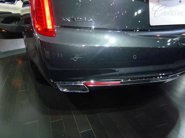
The exhaust outlets are a nice touch. What this car lacks in overall appeal it does try to make up for in details.
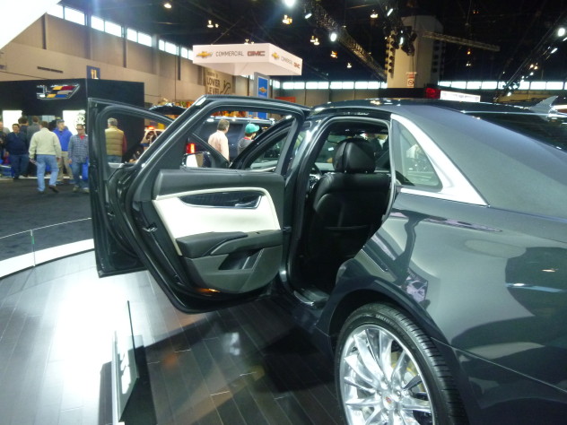
From where I stood, the interior appeared to feature quality materials and the back seat looked sufficient. Rear leg room is about an inch shorter than the outgoing Cadillac DTS.
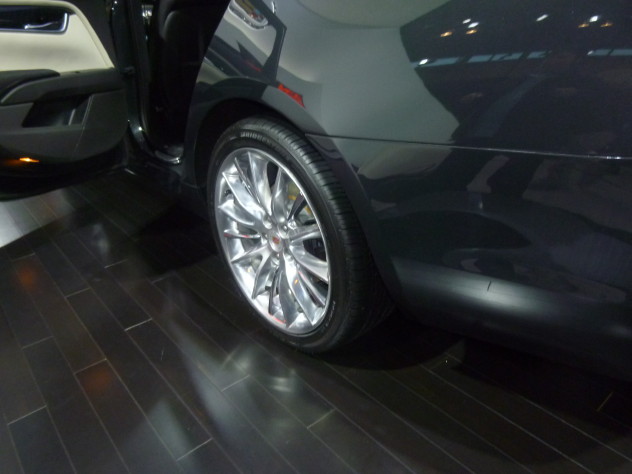
These polished aluminum wheels are actually quite elegant.
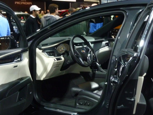
The shape of the door panels, seats, and dashboard look futuristic while retaining traditional warmth. Unfortunately, the LCD-based instrument cluster appears to have very poor contrast. Maybe it will look better from the driver’s point of view.
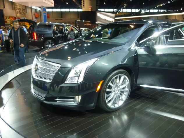
This XTS Platinum’s grill is garish, vulgar, and distasteful.
The distance from the hood to the top of the front wheels appears to be a mile long, a displeasing design trait typically seen on economy cars due to packaging necessities. It loosely takes on the shape of an elongated Chevy Aveo.
I despise this car but I can breathe easy knowing that it’s merely a placeholder. Cadillac can do better, and it will.
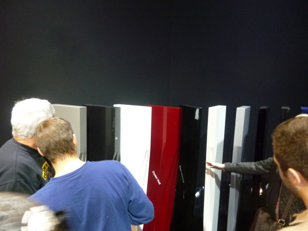
Cadillac’s color palette.
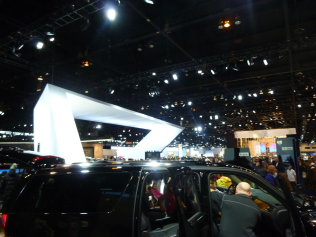
Escalade
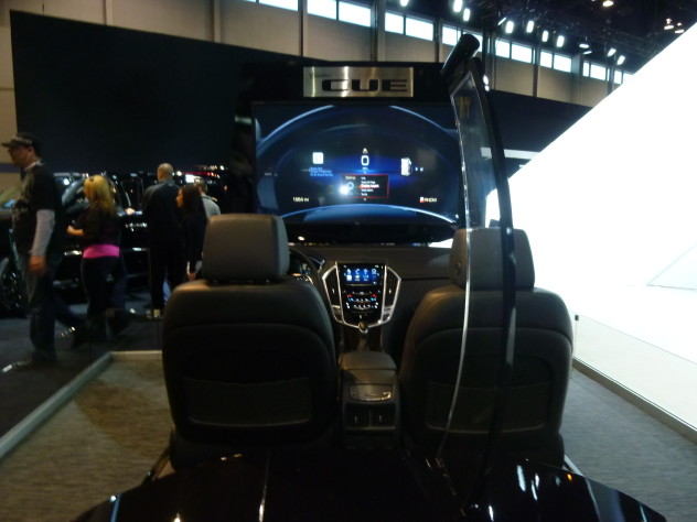
Cadillac’s CUE infotainment system.
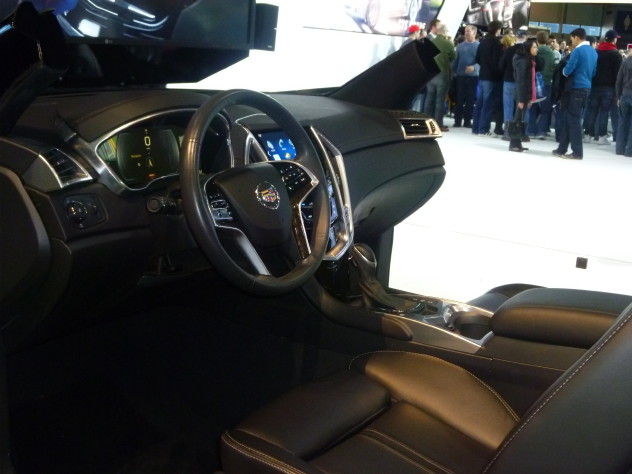
Again, the contrast on the LCD looks poor. It may look better from head-on.
Part 1: 2011 Subaru Legacy 2.5, Deep Dish Pizza
Part 2: Cadillac
Part 3: Mercedes-Benz
Part 4: Chevrolet, GMC, Buick
Part 5: Volvo, Lincoln, Audi, The Green Man!
Part 6: Acura, Lexus, Land Rover
Part 7: Jaguar, Hyundai, Maserati, Aston-Martin, McLaren
Part 8: Ford, Honda, Chrysler, Jeep, Dodge
Part 9: Nissan, Mazda, Subaru, Suzuki, Kia
Part 10: Lamborghini, Classics, Retail Booths, Army, Scion, Volkswagen
Part 11: Greek Dinner, Portillo’s, Ikea, Conclusion